

Adobe’s 2026 holiday forecast expects 57.4% of online spending this season to come through mobile devices, rising to about 63% during Cyber Week. In plain terms, most of your holiday customers will be holding a phone. If your store only looks good on a laptop, you are designing for the minority.
This guide walks through what a good mobile journey looks like, from the ad or email click to the order confirmation, and how to test yours before Black Friday on November 27.
The figures above come from Adobe’s U.S. holiday forecast, published on September 28, 2026, and describe U.S. online retail overall. Your own store’s split may be different, so check your own analytics for the share of visits and orders from phones.
Why phones matter more than ever
People browse on phones everywhere: on the sofa, on the train, while waiting in a queue. That is exactly when they see your ads and emails. If the page is slow, awkward or hard to read on a small screen, they leave, and they may not come back on a laptop later.
Mobile shoppers also have less patience for typing. Long forms, small buttons and surprise costs are all more painful on a phone, which is why the checkout deserves as much attention as the product page.
The mobile journey, step by step
1. The landing page
This is where the ad or email click arrives. It should load quickly, show the offer clearly and match what the ad promised. Keep the first screen simple: a clear headline, a good image and one obvious next step. See how to speed up your store.
2. Browsing and search
Menus should be easy to open and tap. Collections should show clear images and prices, and filters should work with a thumb. Make sure your search finds products and that a sale collection is easy to reach.
3. The product page
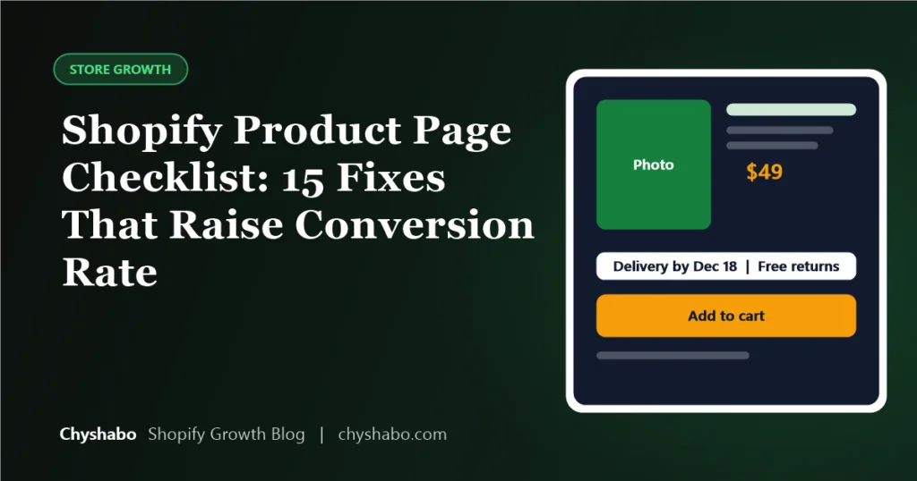
Text should be readable without zooming, images should swipe smoothly, and the add-to-cart button should be easy to see and tap. Work through our product page checklist on a real phone.
4. The cart
The cart should show the total, any discount and the shipping cost clearly. A shopper should not be surprised at the next step. If you offer free shipping above a threshold, show how far they are from it.
5. Checkout
This is where most abandoned carts happen. Keep it as short as possible. If Shopify offers accelerated checkouts such as Shop Pay, Apple Pay or Google Pay in your region, turn them on, since they fill in details automatically and cut typing. Check that your discount codes work and that the final price matches what was promised.
6. The confirmation and what happens next
The confirmation page and email should be clear, with order details and delivery expectations. A good experience here reduces support questions and builds trust for next time.
How to test it properly
- Use a real phone, not just a narrow browser window. Use your own and borrow another, ideally one older or smaller.
- Test on mobile data, not only fast Wi-Fi, to see how it feels for most shoppers.
- Place a full test order with a discount code, using each payment method you offer.
- Ask someone who does not know your store to buy something while you watch silently. Note every point where they pause.
- Check your analytics for the share of visits and orders from mobile, and compare conversion between mobile and desktop. A large gap tells you where to look. Remember that Shopify changed session counting on September 21, so compare periods after that date with each other. See our guide to the change.
Common mobile problems to look for
- Buttons too small or too close together to tap accurately.
- Pop-ups that cover the screen and are hard to close.
- Sticky banners that take up too much of the screen.
- Text that is too small, or images that push the buy button far down the page.
- A checkout that asks for more information than it needs.
- Slow pages caused by heavy images and too many apps.
Final thoughts
If most of your shoppers use a phone, then the phone version of your store is your store. Test it as a shopper would, fix the friction you find and keep changes simple as the sale approaches. Even small fixes can make the difference between a started order and a finished one.
If your mobile experience needs more than small fixes, our Shopify store redesign and conversion rate optimization services focus on exactly this. Our Black Friday checklist shows where mobile fits into the whole picture.