

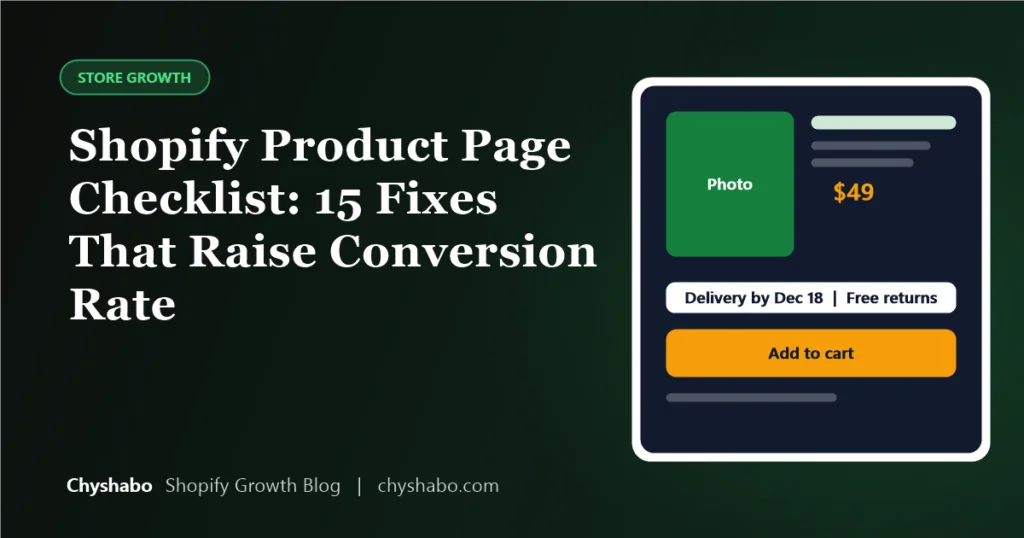
In Q4, paid traffic usually gets more expensive because more advertisers are competing for the same shoppers. When every click costs more, the cheapest way to make more money is not more traffic. It is a product page that turns more of the visitors you already have into customers.
Here are 15 fixes we would check on a product page before the holiday rush. They are practical, they do not need a rebuild, and none of them rely on tricks. We cannot promise a specific lift in conversion rate, since every store and product is different, but each of these removes a reason for a shopper to hesitate.
If you change everything at once, you will not know what worked. Change what is clearly broken first, then test the rest. Remember that Shopify changed how sessions are counted on September 21, so compare results after that date with each other. Our sessions update guide explains why.
Above the fold: what the shopper sees first
1. A clear, specific title
The title should say what the product is, in plain words. Titles copied from suppliers, stuffed with keywords, are harder to read and trust.
2. Price, delivery and returns visible without scrolling
Shoppers want to know the cost, when it will arrive and whether they can send it back. If they have to search for these, many will not bother.
3. A strong main image
The first image should show the product clearly, on a clean background, and load quickly. Avoid filling it with text.
4. A button that stands out
The add-to-cart button should be easy to see and tap on a phone, with clear wording. On mobile, check that it is reachable without awkward scrolling.
Images and proof
5. Several images that answer questions
Show the product from different angles, in use, with a size reference and with any important detail. Photos should answer the question “will this suit me?”.
6. Short video, if you have it
A short clip showing the product working can help, but only if it loads quickly and does not push important information down the page.
7. Real reviews
Reviews from real customers build trust. Never write or buy fake reviews. They are against the rules of most platforms and mislead shoppers. If you have few reviews, say what you can honestly say about quality, guarantees and support instead.
8. Trust signals that are true
Secure payment icons, a clear returns policy and visible contact details help. Only show badges and claims you can back up.
Description and details
9. Lead with benefits, then specifications
Start with what the product does for the buyer in a few short lines. Follow with materials, sizes, what is in the box and care instructions, laid out so they are easy to scan.
10. Answer the obvious questions
Think of the last five questions customers sent you. Put those answers on the page. A short, honest FAQ saves support time and removes doubt.
11. Be clear about who it is not for
Telling a shopper when a product is not the right choice builds trust and cuts returns. It also helps search engines and AI tools describe your product accurately.
Options and checkout
12. Simple variant selection
Make sizes and colours easy to choose, show which are sold out, and update the image when a variant changes. Confusing options are a common reason for abandoned carts.
13. Gift-friendly options
For the holidays, consider a gift note or clear packaging details if you can offer them. Mention delivery cutoffs so shoppers know whether a gift will arrive in time. See our guide to holiday shipping cutoffs.
14. Related products and bundles that make sense
Suggest items that genuinely go with the product. Done well, this raises order value without feeling pushy. See our guide to bundles and gift guides.
15. A fast, tidy mobile experience
Most holiday browsing happens on phones, so check the page on a real one. Look for text that is too small, buttons too close together, and images that push everything down. Our guide to mobile checkout covers the rest of the journey.
How to put this into practice
- Pick your three best-selling products, or the ones getting the most ad traffic.
- Go through the 15 points above for each one on a phone.
- Fix the obvious gaps first: missing delivery information, unclear photos and slow-loading media.
- Check your results using orders and revenue, and use our conversion rate revenue calculator to see what a small improvement is worth.
Final thoughts
A product page is a salesperson that works around the clock. When it answers questions clearly, shows the product honestly and makes buying easy, your ad spend goes further. Start with your top products and be consistent.
If you would like help, our product page design service rebuilds your key pages around these principles, and our store and funnel audit will show you where shoppers are dropping off. For the wider picture, see our Black Friday checklist.